
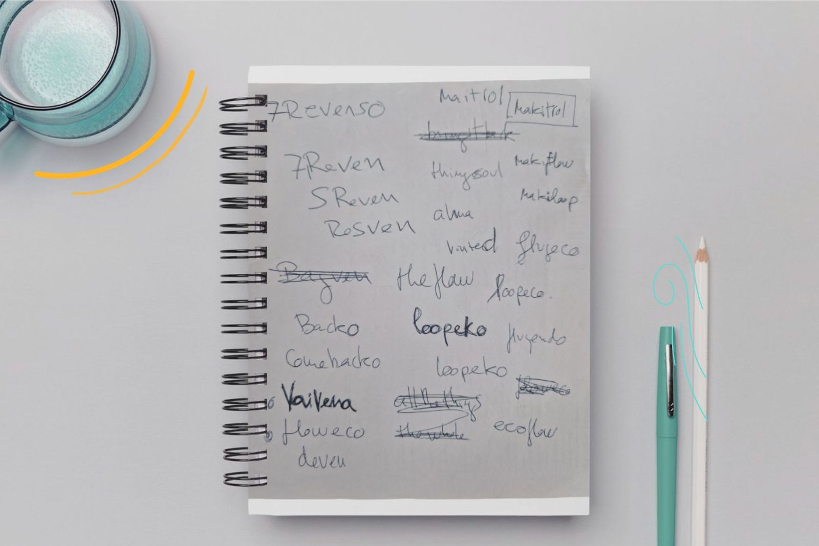
Where does Revivack come from? Finding the right name for a disruptive and winning idea was crucial to get the ball rolling, and it couldn’t be just any name. It was essential that it aroused interest, that it was obvious and spoke for itself, and it also had to be multilingual, understandable and pronounceable by the whole world.
After a creative process of 6 long months we came up with it. It was waiting for us, the very crafty one, mimicked in a very obvious way with an endless number of concepts and with other names that we also took for granted during the process. We will now tell you the story that is summarised in this presentation:
The story of our name de Revivack
The 7 Rs: the basis of the idea
If the idea of Revivack arose after an incredible experience from our previous company, POPSICASE, when it came to naming it, the first candidate for the title was the UNIVERSE RE, the 7 Rs, i.e. recycle, return, reduce, repair, reject, reuse and recover, which during that period were the key to our raison d’être.
We worked hard around the large group of R’s, but we realised that there were many more R actions, we counted up to 13, that had to do with the circular economy.
So we kept thinking…
The first law of thermodynamics as a second point of reference
Revivack is a take-back system, which aims to generate orderly waste. That’s why we introduced the concepts that evoke MOVEMENT, FLOW and the DEVENIR OF THINGS. So, with thermodynamics as our motto and understanding that if energy is neither created nor destroyed, but transformed, the same thing must happen to waste, we started to throw more darts, each one more colourful and interesting than the last.
Vaiven, Ecoflow, Fluir7, Panta Rhei (a classical concept that Plato attributed to the philosopher Heraclitus, which means: everything flows, everything is in constant change), MakeItFlow, Loopeco, Bucle, Loop2loop…
The process, which we collected in notebooks, blackboards and loose papers, was endless and the more names we came up with, the more disoriented we were because none of them convinced us.
So we kept on thinking…
Take back System – the point of fit
Although the movement was clear, there were two concepts that we had not introduced and they were very suggestive:
THE TAKE BACK: Our proposal of individual return to group unwanted objects for the purpose of being taken back was a value we could not overlook.
NEVER DIE: This eternal flow of materials and energy leads us to the concept of being ALIVE (VIVO in Spanish), more than enough reason to be happy and shout VIVA! left and right.
And it is then, shuffling these two concepts (to BE BACK and VIVA) that we arrive at VIVACK, as the final candidate for our vacant appellation. We were encouraged. We started to work on logos, graphic universes and brand values?

But we did it at a slow pace and with little passion, because there was something missing. The R universe had so much weight that we couldn’t dismiss it, and Vivack was devoid of them.
So we kept thinking…
Reviving was the key
We started to spin the R’s around and put it everywhere. We wrote Rs ad nauseam, until sitting over coffee, we came up with a concept that hadn’t occurred to us before: REVIVE YOUR STUFF.
The rest came on its own. REVIVACK as a name that captures all of the above, and that was also in line with the brand values we were going to start working on:
POSITIVE – We are optimistic and we like good vibes. Within the global doom and gloom message, we want to be a solution, a hope, an enthusiastic ally, we are the YES WE CAN!
CLOSE – A complex and new project needs a didactic, simple, direct, friendly and empathetic language. Humans behind the technology – We are your guide on the road to circularity!
TRUSTED – We know what we are talking about and the services we offer are impeccable. Our technology is solid, reliable, secure and quality – we promote transparency and trust!
With Revivack as the definitive name, the rest was a piece of cake: the name in black, the K with an arrow that takes us backwards, and a leading R made up of 3 parts, emulating the assembled components of any object, with bright colours that are not green, because being “eco” is no longer cool, but should be part of the DNA of any project. So we opted for turquoise blue, the colour of the Mediterranean Sea and a good part of our blue planet, and orange, the colour of optimism and sunshine to give it that warmth that we are looking for and that you will find in any corner of this close, positive and very, very professional project, because behind it we are a great team of people who know a lot 😉